Emily Lakdawalla • Oct 01, 2015
Favorite Astro Plots #1: Asteroid orbital parameters
Several weeks ago, a random tweet from exoplanetary astronomer Jessie Christiansen caught my eye:
Plots Are Boring Challenge: share your favourite astro plot and say why? Mine is the Chariklo transit - rings, baby! pic.twitter.com/MPpMRyaAiH
— Jessie Christiansen (@aussiastronomer) September 3, 2015I've always loved a good scientific graph. I own three of Edward Tufte's books on the visual display of quantitative information. I have a particular fondness for graphs where a mass of points, each point representing one entity (one sample, one asteroid, one event), displays structure that emerges from the patterns of points' presence and absence on the plane.
So I picked one of these charts to use in a reply to Jessie. I know other scientists are attached to their graphs, too, so I challenged my followers to share their favorites with the hashtag #FaveAstroPlot on Twitter. I got dozens of replies and Storified them here. I understood some of the plots that were tweeted in reply, but found some impenetrable, and in most cases I knew that there was more to a plot than I could see myself. So I emailed a bunch of scientists to ask them about their plots -- what they say, and how they're used in the scientists' subfields. Almost everybody sent me back a blog-length reply! So this is the first in what will be a long series of posts about favorite plots in planetary science.
The plot that I chose compares two properties of the orbits of asteroids: the semimajor axis and the eccentricity. I downloaded my plots from the Minor Planet Center, which provides a variety of other kinds of plots of asteroid orbital characteristics and absolute magnitudes.
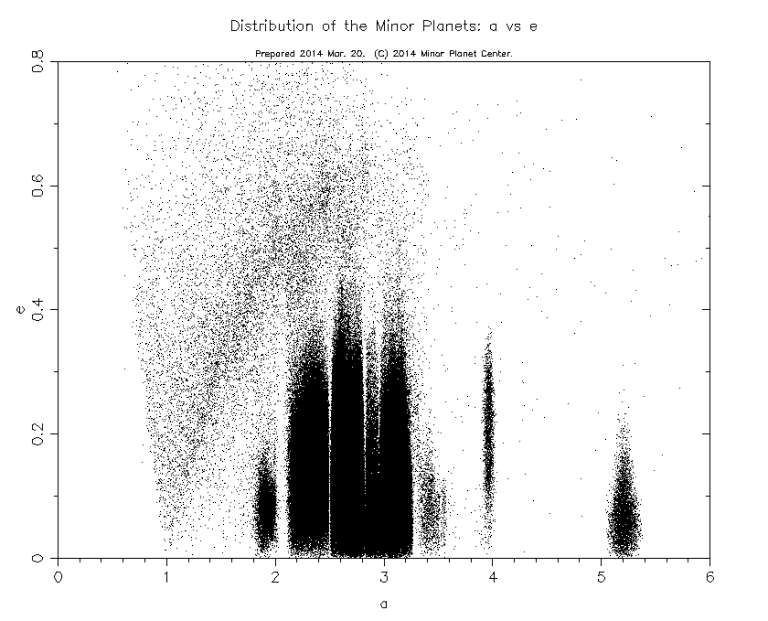
The semimajor axis describes the size of the orbit: it's the longest radius of the ellipse that describes the orbit. For things with circular orbits, the semimajor axis is just the radius of the circle -- the object's distance from the Sun. A lot of asteroids don't have circular orbits, but most are close enough to circular that you can think of the semimajor axis as approximating the object's distance from the Sun. The eccentricity describes how elliptical an orbit is: an eccentricity of 0 is a circular orbit, while an eccentricity of 1 would be a parabolic orbit. Each dot on this chart is one asteroid; in places, dots pile up on each other, filling it in black. But there are very sharp boundaries to these black areas.
It gets even more interesting when you plot semimajor axis versus inclination. Inclination is the angle that an asteroid's orbit makes with respect to the plane of Earth's orbit. On this plot there are blobs of points sharing orbital distances and orbital inclinations, separated by voids with virtually no asteroids.
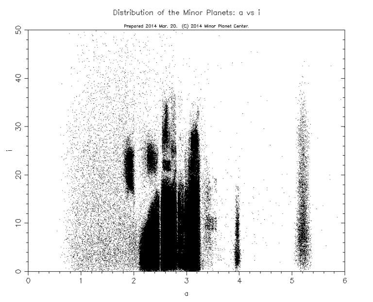
Many different phenomena contribute to the patterns of asteroid positions on these diagrams. The most important are:
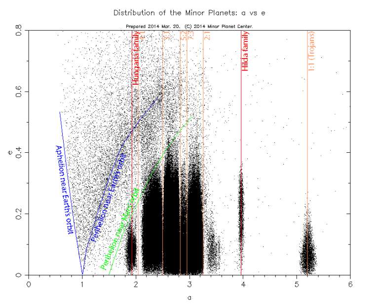
- Orbital resonances with Jupiter: asteroids whose periods are integer ratios of Jupiter's get gravitationally shoved into different orbits, leaving gaps (called Kirkwood gaps), the most prominent of which are at 4:1, 3:1, 5:2, 7:3, and 2:1 resonances.
- A special class of objects, called the Trojans, share Jupiter's orbit, held in Jupiter's L4 and L5 Lagrangian points by Jupiter's gravity. They are thought to be objects that began their existence in the Kuiper belt.
- Past collisions have disrupted larger asteroids into hundreds of smaller ones on similar orbits; these asteroid families produce clumps on the plot, large numbers of bodies whose orbits have similar semimajor axis, eccentricity, and inclination to the original parent body.
Here, I've drawn in the prominent resonances in orange and labeled a couple of obvious families in red:
One more prominent "structure" appears on the semimajor-axis-versus-eccentricity diagram that turns out not to be a real feature of the asteroid population: a fan-shaped distribution of asteroids that begins on the X axis at 1 AU and then spreads out above it. This structure is composed of asteroids whose aphelion or perihelion is near Earth's orbit. I've sketched those boundaries in dark blue on the diagram:
It looks like there's an unusual number of asteroids on these orbits, but what's really happening is that there is an observational bias. These are mostly small, dim asteroids that wouldn't have been discovered except that they just happened to pass very close by Earth. Also, when there is a very short observational arc on a body -- common for faint objects that are discovered when they pass near Earth and then are never seen again -- orbit-solving software often begins with the assumption of an orbit with a perihelion of 1 AU. Asteroid astronomer Joe Maseiro showed me what happens when you take all the asteroids discovered as of May 2015 and plot semimajor axis versus eccentricity, then filter out those with very short observational arcs:
@elakdawalla Here's an example showing the difference if you cut at arc>30. Lots of the weird structures go away. pic.twitter.com/cX8gUkPhwY
— Joe Masiero (@JoeMasiero) October 1, 2015The Minor Planet Center plots that I've used in this blog post don't include information on asteroid color. The Sloan Digital Sky Survey captured colors for many asteroids. As part of his dissertation work, Alex Parker took 88,000 of those asteroid colors and combined that information with their orbital characteristics to produce these eye-popping plots:
@elakdawalla Better with color :) pic.twitter.com/cLfVnZ4cC8
— Alex Parker (@Alex_Parker) September 3, 2015Jake VanderPlas wrote a nice explainer of these colorful plots for Scientific American. The bright green splat near 2.3 AU represents the V-type asteroids: Vesta and all its fragments. The magenta blob at 3.0 AU is the Eos family. And so on. You can read Alex's paper to see how color helps split out families (and then what you can learn about those families once you've used colors to help identify which asteroids belong to them).
It would be fun to think about other, different ways you could show asteroids on plots like these. Maybe a contour plot showing number density? Or some way to indicate the distribution of mass? or albedo? or discovery date? Each variation would tell a slightly different story. Plots are fun!
Over the coming months I'll share many other "favorite astro plots" with you, some of the explanations written by me, but most written by scientists. If you're a scientist and you have a favorite plot that you'd like to explain, send me an email!
Support our core enterprises
Your support powers our mission to explore worlds, find life, and defend Earth. You make all the difference when you make a gift. Give today!
Donate

 Explore Worlds
 Find Life
 Defend Earth