Emily Lakdawalla • Nov 01, 2011
What do Dawn's color ratio images of Vesta mean?
The Dawn mission to Vesta continues to release an image every day, and recently they have been releasing lots of color images. I like color pictures for aesthetic reasons, but color is actually a very important property of planetary surfaces. Color, and how it varies across a planetary surface, provides many pieces to the puzzle of that planet's history, and learning how to read those clues from those colors is one of the things they teach wannabe planetary scientists.
Here's one recent example. If the caption doesn't make much sense to you, don't worry -- that's why I'm writing this blog entry. Grab a snack. It takes me a while to explain.
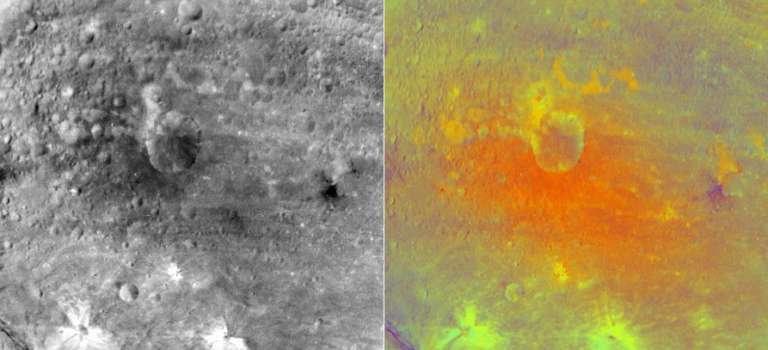
Many of you may be wondering what they mean by "ratio" and probably also what the heck a "ferrous absorption band" is. I'm going to try to explain!
First things first. Space cameras are not like the one in your phone or point-n-shoot pocket camera. Space cameras usually have detectors that can detect light across slightly more of the electromagnetic spectrum than human eyes can see, from near-ultraviolet to near-infrared wavelengths. More importantly, while the pictures that they take are often pretty, they are not intended to be for snapshots; they are sophisticated, precise scientific measuring devices. Each tiny pixel in a space image is a carefully calibrated measurement of how many photons reached the camera, and for Dawn's Framing Camera, there are a million pixels in each image, a million careful measurements of how much light different spots on Vesta's surface reflect.
To get information on the color of a planetary surface, Dawn's camera team -- like those on Voyager, Opportunity, and Cassini, among many others -- added a filter wheel to the front of their camera. A filter is like a gel on a theater light. It turns white light into colored light. It does this by limiting the wavelengths that can pass through the filter. So a "red" filter typically permits only red wavelengths to pass through, but not blue or green or ultraviolet or infrared, and an "ultraviolet" filter permits only the shortest wavelengths of light to pass through, but not yellow or red or infrared. When you put a filter in front of the camera, the picture you get is a measurement that corresponds to how many photons from a limited range of wavelengths hit the camera's detector. Each pixel is recorded as a number; pixels with higher numbers received more photons. Here's a photo of one of the Mars Exploration Rover Pancams, taken apart so that you can see the filter wheel. It's a wheel because it can rotate to different positions to place different filters in front of the camera lens.

Dawn's Framing Camera has eight different filters fairly evenly spaced across the part of the spectrum that its CCD is capable of detecting. This graph shows what happens when white light (light with a broad mix of wavelengths) is shone through Dawn's different filters. The "F1" filter, or clear filter, lets the white light pass directly through. The left image in the pair I posted above was taken using this filter. All the other filters let only narrow slices of wavelengths of light through.

Filters are usually referred to by their center wavelengths in nanometers. Here is a list of the center wavelengths of each of Dawn's filters:
- F1: (clear)
- F2: 548 nm ("green")
- F3: 749 nm
- F4: 918 nm
- F5: 978 nm
- F6: 829 nm
- F7: 650 nm ("red")
- F8: 428 nm ("blue")
For short, rounder numbers are used to refer to these filters. For example, they call it "750" instead of "749." Among the filters, there are three that roughly correspond to wavelengths detectable by the color-sensitive cone cells in human eyes. These are referred to as red, green, and blue. But there are four filters in longer, near-infrared wavelengths. Why?
To answer that question, we have to look at a different kind of graph, a spectrum. Or, as most people in planetary science refer to them, "squiggly lines." ("Squiggly lines" is one of those terms that was derogatory when initially coined but has been incorporated into the vocabulary of the scientists who study squiggly lines.) Here's a set of spectra that Ryan Anderson put together for me for a post I wrote a while back about an area of the surface of Mars called "White Rock," along with an explanation of how a spectroscopist can read compositional information from the wiggles in the spectrum. Mars' surface has rocks with compositions somewhat similar to what you'd find on Vesta. If you don't follow the caption, don't worry; keep on reading. (Note that a different unit is used here, microns instead of nanometers; 0.4 microns = 400 nanometers.)
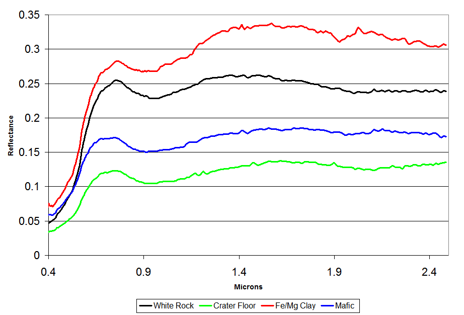
All the spectra bear similarities. They all have a strongly upward slope from 0.4 to 0.7 microns, the visible range, which gives all of them the overall red color that is common to Mars. All have a dip near 1 micron, indicating the presence of iron; the White Rock, crater floor, and mafic spectra also contain a much smaller dip near 2 microns, indicating that the iron and magnesium is found in a mineral called pyroxene. The clay spectrum has noticeable dips at 1.9 microns (indicating that water is bound in the chemical structure) and 2.3 microns (indicating the presence of hydroxyl, OH- groups, another signature of the presence of water). Although White Rock bears some similarity to the clay spectrum, it does not contain those two dips, so there is no clear evidence for the presence of water.Image: Courtesy ESA / OMEGA / plot by Ryan Anderson
All the spectra bear similarities. They all have a strongly upward slope from 0.4 to 0.7 microns, the visible range, which gives all of them the overall red color that is common to Mars. All have a dip near 1 micron, indicating the presence of iron; the White Rock, crater floor, and mafic spectra also contain a much smaller dip near 2 microns, indicating that the iron and magnesium is found in a mineral called pyroxene. The clay spectrum has noticeable dips at 1.9 microns (indicating that water is bound in the chemical structure) and 2.3 microns (indicating the presence of hydroxyl, OH- groups, another signature of the presence of water). Although White Rock bears some similarity to the clay spectrum, it does not contain those two dips, so there is no clear evidence for the presence of water.
Spectra are very meaningful to spectroscopists, but for the rest of us, they're just squiggly lines; looking at them, I might as well be trying to read Japanese.
Color ratio images are a way of taking the most important information from the spectral data and putting them into a format that even geologists can understand. I'll repeat that first image that I showed and explain what the different colors have to do with those spectra:

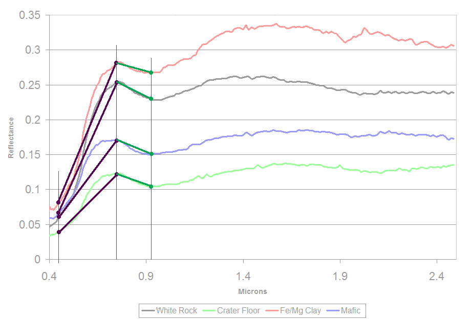
The red channel of the image is made by taking the image captured through the 749-nanometer near-infrared filter and dividing it by the image captured through the blue filter. "Dividing" two images means they take the value of each pixel in the near-infrared filter and divide that by the value of the corresponding pixel in the blue filter. To understand why they'd want to do that, here's the spectra again, but now I've highlighted the points on each spectrum corresponding to the 440-, 750-, and 920-nanometer filters:
Nearly every rocky body in the solar system has a "red slope," meaning that it's brighter in red wavelengths than it is in blue wavelengths, and true color pictures look reddish-brownish. But some things are redder than others. In the spectra above, you can see that the red squiggle, representing clay minerals, is MUCH more reflective at 750 nanometers than it is at 440, giving that line a steep slope, while the blue squiggle has a lower slope. So if you divide the 750-nanometer image by the 440-nanometer image, your resulting image is brighter where stuff is relatively redder, and darker where stuff is bluer. The image has become a map containing spectral information, so you can read a million spectra at once. Furthermore, all of the confounding changes of brightness and darkness due to shadowing have been eliminated, because shadowing darkens all wavelengths equally, so the ratio remains constant.

Now look at the difference between the values at 750 and the values at 920. If you go back to the spectra again, you'll see that they're all brighter at 750 than they are at 920. But the blue, green, and black squiggles have a deeper valley at 920 nanometers than the red squiggle does. This "valley" appears in a spectrum when the minerals in the surface contain iron. More precisely, the valley appears when the iron atoms have two electrons stripped away. This is called "ferrous" iron, as opposed to "ferric" iron, which has three electrons stripped away. Ferrous iron appears in the very common rock-forming minerals olivine and pyroxene, so wherever you see that valley, you can guess that those minerals are present. It could also mean that the surface there is younger; being exposed to space tends to flatten spectra over time, shallowing those valleys that are used to diagnose the presence of minerals. (All of this is a gross oversimplification of the science of spectroscopy, of course, and my apologies to those of you whose science I'm mangling.)
So if you take the 750-nanometer image and divide it by the 920-nanometer image, you get a map that shows you where olivine is more abundant (it's brighter) and where it's less obvious (it's darker). In fact, you can just hand this image to a geologist and say that it's probably brighter where there's more olivine or where the surface is fresher and darker where there's less or it's older, and the geologist doesn't have to know a thing about spectroscopy to be able to read some information from the map.

To get trickier, you can take advantage of human color vision ability and combine your how-red-is-it map with your how-much-olivine-is-there map in a color picture. The false color combination has the how-red-is-it map in the red channel; the how-much-olivine-is-there map in the green channel; and the how-red-is-it map, inverted (making a how-blue-is-it map) in the blue channel. Thus: stuff that looks red really is redder than other stuff; stuff that looks blue really is bluer than other stuff; and stuff that looks green has more olivine. The CRISM team has been making maps something like these to help non-spectroscopist geologists understand compositional information on the surface of Mars for several years. (CRISM is a spectrometer on the Mars Reconnaissance Orbiter.)
Usually, for planets and moons and asteroids that have no atmospheres, it is observed that redder surfaces have been exposed to space longer than bluer surfaces. Old cratered plains are often redder; fresh crater rays are often bluer. So redness is often used as a proxy for age. So it's really weird to me that half of the spray of ejecta from the crater Numisia in Dawn's image is showing up as appearing red in this false color image. Maybe that's not actually ejecta? And those blobby orange deposits above Numisia are interesting, too; they're spectrally different somehow (that they are orange suggests that they are both red and relatively olivine-rich or relatively fresh; "red" and "fresh" don't usually go hand-in-hand).
All of this will help Dawn's science team map out the composition of Vesta, and tell a story about its history -- a story that looks like it will be quite different from, say, the Moon's. I'm looking forward to reading that story!
Support our core enterprises
Your support powers our mission to explore worlds, find life, and defend Earth. You make all the difference when you make a gift. Give today!
Donate

 Explore Worlds
 Find Life
 Defend Earth