Emily Lakdawalla • Aug 26, 2010
Jupiter's swirling storms from Voyager 1
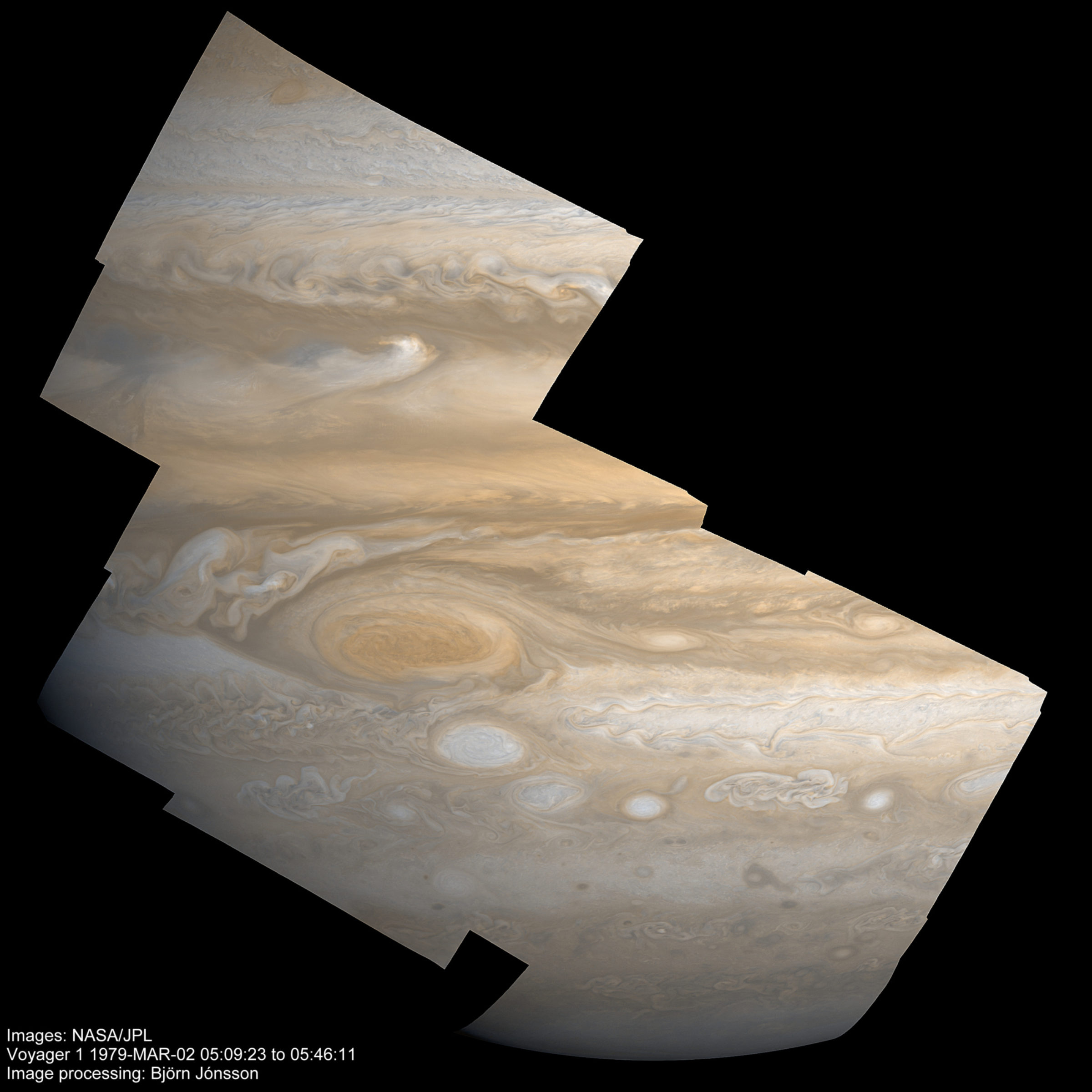
Amateur image mage Björn Jónsson has recently turned his attention back to Voyager 1's close-up images of Jupiter. Before I get diverted into detail, I'll just post his latest work and let you feast your eyes on the fantastic details of turbulently swirling clouds.

Voyager 1 took lots and lots of images that were intended to be assembled into mosaics covering large swaths of the planet at high resolution, but few mosaics have entered the public domain because it is really really hard to make Voyager Jupiter mosaics that look very good. It took a considerable amount of time for the Voyagers to take photos, read them out from the camera, and record them or relay them to Earth, so that for the set of 24 frames required for the mosaic below, it took almost 40 minutes to acquire the data from start to finish. Jupiter rotates once in ten hours, so 24 degrees of longitude passed beneath Voyager during that time. That rotation introduces distortions into the apparent shapes and orientations of the clouds and bands that are hard to align.
It's possible to correct for that motion, but it's not easy. When Björn posted this to unmannedspaceflight.com he explained how he did it, beginning with 24 raw images, 12 each through orange and violet filters (he had to synthesize a green channel from these two). "The raw images were calibrated, reprojected to [a] simple cylindrical projection, mosaicked and then rendered using a typical viewing geometry (there is no such thing as a "correct viewing geometry" because the images were obtained over a 37 minute period with Jupiter rotating)."
What does he mean by "reprojected?" You should be familiar with the problems of representing spherical surfaces in 2D maps. There are many different kinds of map projections that use different geometry to transform spherical worlds to two-dimensional representations. Many geopolitical maps of Earth use the Mercator projection, which represents the shapes of the continents reasonably well but exaggerates the sizes of things at high latitudes; a different projection, appropriately named Polar projection, is often used to show the two poles. Space scientists often employ simple cylindrical projection, where latitude and longitude are converted directly to X and Y coordinates, which really really stretches things out at the poles, but which is really easy to read into software that can convert it to other projections. So what Björn is saying here is that he took the 2D images (which are their own type of projection, Jupiter's 3D appearance to projected on the plane of Voyager 1's camera detector), converted them to simple cylindrical, puzzle-pieced them all together, and then reprojected again to the viewing geometry that Voyager 1 would have had somewhere in the middle of this imaging sequence.
Björn went on: "I then fixed the color balance. The final step was to sharpen the resulting image a bit, mainly to compensate for all of the resampling that the previous processing steps required. This image shows lots of features: The Great Red Spot and one of the three white ovals present during the Voyager flybys, smaller spots, scalloped belt/zone boundaries, gravity waves, a bright equatorial plume and the dusky south polar region. I don't think I'm bragging by saying that this is probably the best Voyager 1 Jupiter mosaic that I know of, mainly because of its size (12 images)."
If you aren't bragging, Björn, you have every right to! He pointed out later on that Voyager images of Jupiter provide higher resolution views than Galileo images did, although Galileo improved on Voyager in the fact that it covered a wider expanse of the electromagnetic spectrum, through red and into near-infrared wavelengths.
Support our core enterprises
Your support powers our mission to explore worlds, find life, and defend Earth. You make all the difference when you make a gift. Give today!
Donate

 Explore Worlds
 Find Life
 Defend Earth

