Judy Schmidt • Nov 09, 2018
How I created a Jupiter rotation video using Hubble data
Recently I created a full rotation animation of Jupiter. I am happy to share a bit about what it is and how I made it. To be clear, this is a 3D generated animation and not a series of telescopic exposures. Most rotation sequences available utilize a similar technique to generate smooth animations, so this is a fairly ordinary undertaking, but there are a few details that make it a little different.
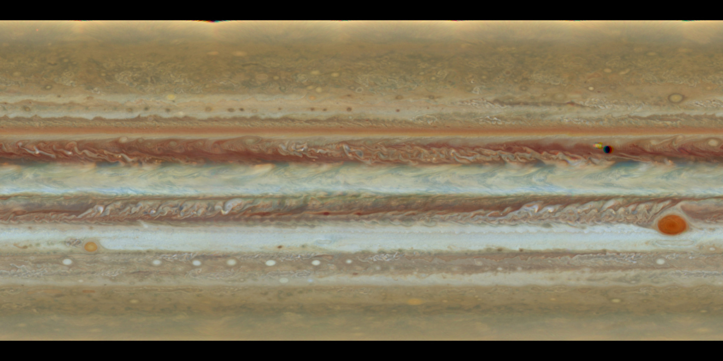
I wanted to make an animation that closely matches the visual appearance of Jupiter from the Hubble Space Telescope. This could have been daunting, but luckily there are a few publicly available resources that make it much easier. Foremost, the maps have already been projected into a convenient 2D format and are free to download from the OPAL page at STScI's archive website. This robust dataset includes eight full maps of Jupiter spanning four years at the time of writing this. The one I chose was Rotation A from Cycle 24.
A color version using available narrowband visible light filters is available for download.
Note that that Io and its shadow were in front of the planet at the time, and they represent a hole in the data. Polar data are also absent due to the extreme angle or being hidden from view. You can see the poles are a bit brighter as well, possibly too bright; I believe that has something to do with a compensation for limb darkening. The poles are a bit mysterious even with Juno orbiting over them and taking a lot of observations.
The texture map I ended up using for the animation.
I made some modifications to the map by taking away some of the contrast, giving it a softer look, and using the healing brush to remove Io and shadow. The poles I filled in with a solid color and feathered into that hard edge to give a more natural look. Arguably it's not very natural, but that is ok with me. This is narrowband imagery, so the colors are more separated than our eyes would see. I try not to dwell on this too much as astronomical color choices are often arbitrary, and I've never actually seen Jupiter.
The next step is to create a spheroid in my 3D program (I use Blender) using Jupiter's real dimensions. I use megameters as a matter of convenience and pull up the polar and equatorial radius from the Wikipedia entry. Never use a perfect sphere and the mean radius, because that's not what Jupiter looks like! I then unwrap the UVs for the mesh using a simple spherical projection, and add the texture map. I can now compare this result with a real image of Jupiter which I conveniently processed a few days prior.
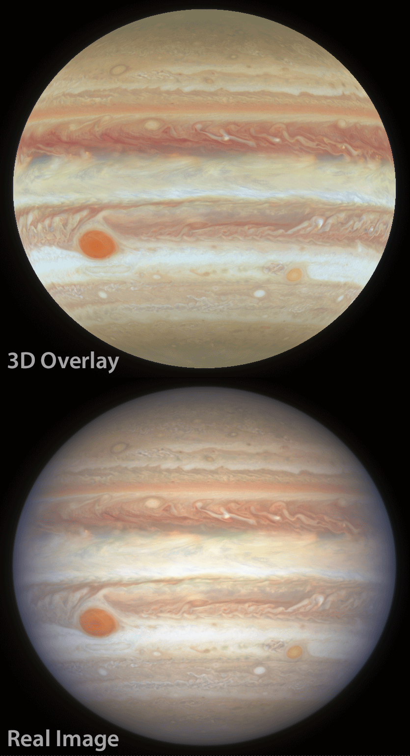
A blink animation showing this comparison:
The shape is perfect, but clouds aren't quite where they should be. There is probably a particular way to unwrap the UVs so that they align better with the OPAL map, but I don't know how to do that right now, and rather than let that stop me, I scoot the UVs around manually with the 3D overlay at half opacity until the model is aligned with the real image.
Much better. Keep in mind that Hubble's Field of View is very small. So small in fact that I use an orthographic camera to view the 3D shape and align it to the Hubble imagery, and it works very well. Another method is to use a camera with a very tiny FOV and move it very far away from the planet, much like a real telescope. Things get awkward doing this, however, so I have found that I prefer the orthographic camera.
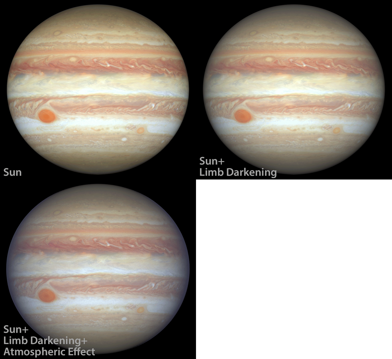
All we're missing now is the Sun, some limb darkening, and that atmospheric scattering around Jupiter's equatorial limb that gives the planet its character. Blender's Cycles rendering engine uses physical calculations to create realistic renderings, but it is not a planet simulator by any means, so what I do is hack together whatever shaders I can to create a reasonable representation of Jupiter.
Following is a blink animation showing a simple rendering with nothing but the Sun illuminating the planet, followed by a shader hack that darkens the limb, and another hack that adds a shell of volumetric material around Jupiter to create that hazy atmospheric scattering and absorption around the equatorial region.
The volumetric layer sits above Jupiter's atmosphere and adds some thickness which is apparent at the edge of the planet. I remove that extra thickness post render with compositing by masking it off. I also blur just the edges of the planet slightly because very hard edges make it look obviously computer-generated. Finally, a very faint glow is added by blurring the entire planet and overlaying that blurred image at a very low opacity. That's one of those subtle finishing touches that I think looks nice.
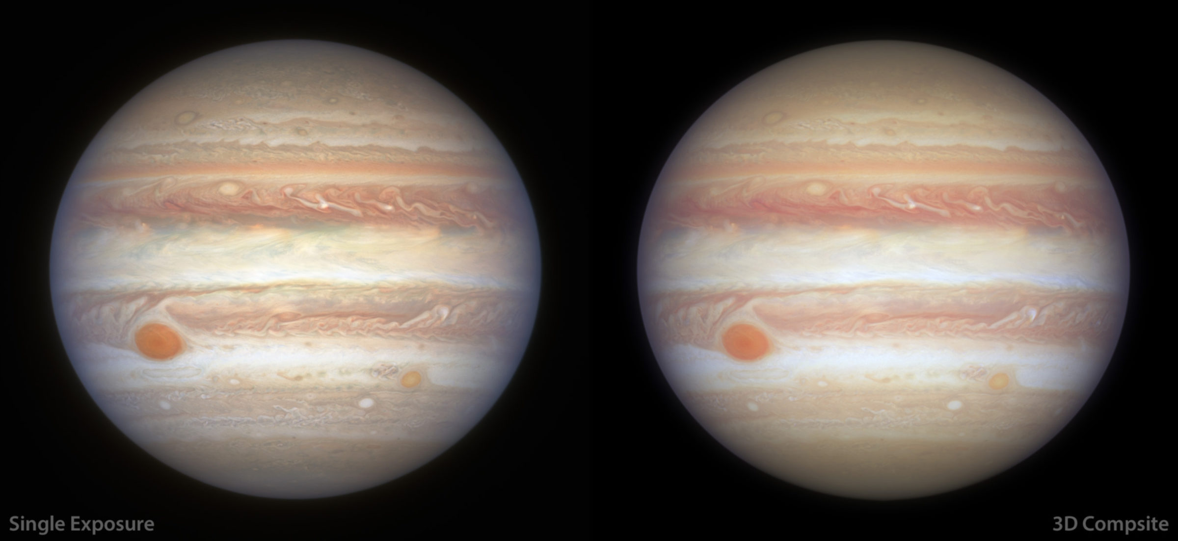
This work used data acquired from the NASA/ESA HST Space Telescope, associated with OPAL program (PI: Simon, GO13937), and archived by the Space Telescope Science Institute, which is operated by the Association of Universities for Research in Astronomy, Inc., under NASA contract NAS 5-26555. All maps are available at http://dx.doi.org/10.17909/T9G593.
Support our core enterprises
Your support powers our mission to explore worlds, find life, and defend Earth. You make all the difference when you make a gift. Give today!
Donate

 Explore Worlds
 Find Life
 Defend Earth