Emily Lakdawalla • Oct 31, 2011
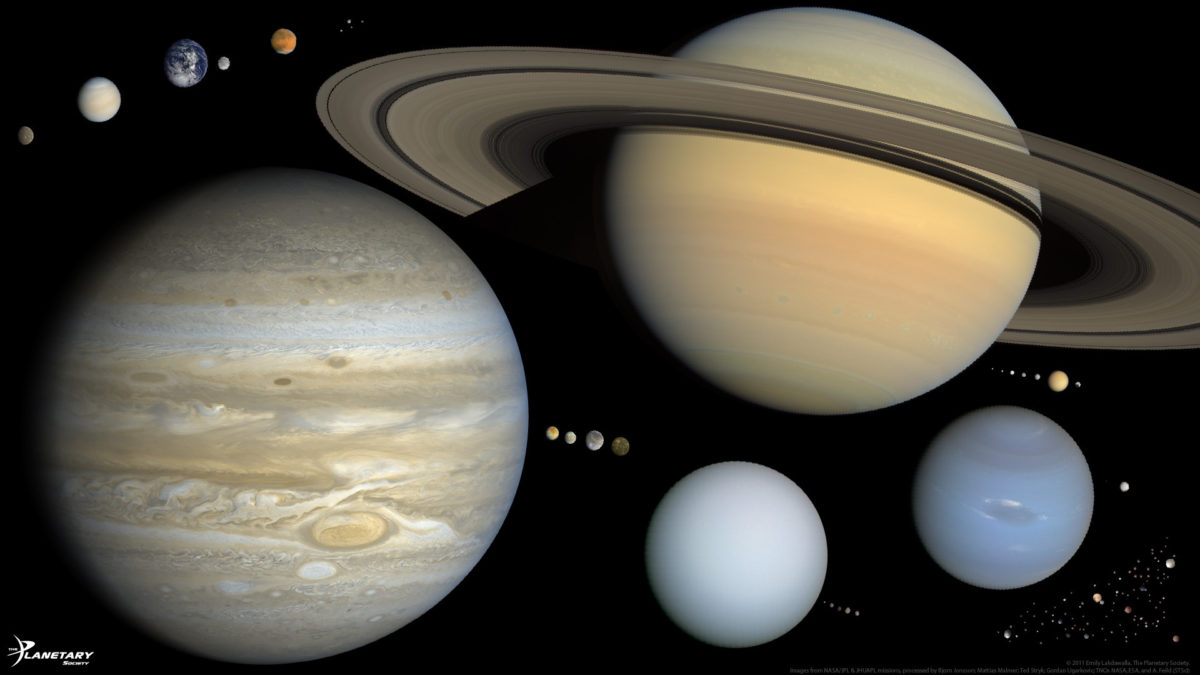
Scale solar system presentation slide, version 2
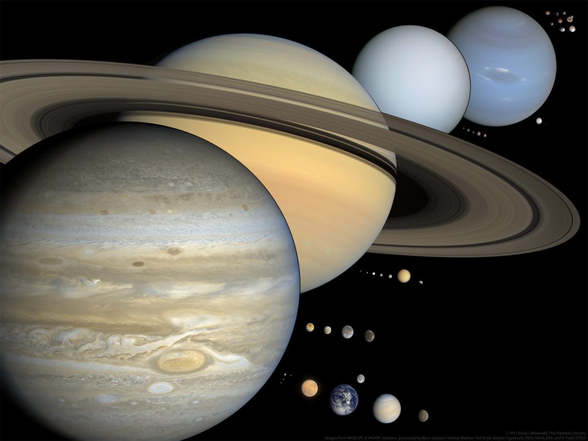
Last month I posted a preliminary version of a slide I was working on for use in my public presentations, a slide that contains everything in the solar system bigger than 400 kilometers across, and invited comment. I've listened to all of your comments and corrections and come up with a second version. One of the most frequent comments was that the overlapping of the giant planets created an optical illusion, making people think that it was perspective that diminished the sizes of Uranus and Neptune, which made Saturn appear larger than Jupiter. I liked overlapping the giant planets for aesthetic reasons, but am trying a non-overlapping version in this new one. What do you think?

For reference, here's what version 1 looked like.

Support our core enterprises
Your support powers our mission to explore worlds, find life, and defend Earth. You make all the difference when you make a gift. Give today!
Donate

 Explore Worlds
 Find Life
 Defend Earth

