Emily Lakdawalla • May 13, 2010
New maps of Enceladus and other moons
Every time Cassini gets reasonably close to one of the moons of Saturn, whether the close approach is a targeted one or just an opportunistic encounter, its planners usually take advantage of the proximity to take a bunch of photos. I post those images a lot on this blog. But it might make some people wonder -- OK, that's a pretty photo; but do we really need more pretty photos of Tethys now? Is there any scientific value to gathering more images?
Yes, of course there is, and here's just one of many reasons why. On each of these encounters, Cassini only sees a fraction of the surface at high resolution. To begin with, only half the surface is sunlit at any given time; and then Cassini's view is only very good for a region that is facing the spacecraft. So it takes numerous encounters to build up high-quality views of the entire surfaces of these worlds, for all 360 degrees of longitude and all 180 degrees of latitude. In fact, since the equinox has only just passed, bringing light to the north polar regions of the moons for the first time since Cassini's arrival, it hasn't yet captured good views of the entire north poles of all the moons.
But Cassini's data is good enough for the formal release of several high-quality global maps of the moons, which the team has done by a paper published last year in chapter 24 of a book titled Saturn from Cassini-Huygens. In the paper, "Cartographic Mapping of the Icy Satellites Using ISS and VIMS Data," (PDF format, 40+ MB, available from the CICLOPS website) the authors Thomas Roatsch, Ralf Jaumann, Katrin Stephan, and Peter Thomas summarize the results of five years of Cassini's mapping work (with a bit of Voyager data thrown in to cover some of those north polar areas).
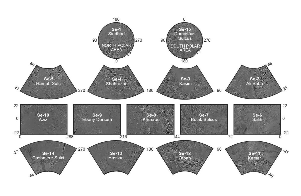
Here's an example of the kind of map products they've created; this one is for Enceladus. First is an index sheet to all the individual maps in the atlas: fifteen in all. The whole atlas is at 1:500,000 scale. For those of you accustomed to using topo sheets as maps for hiking, those topo sheets typically have a 1:24,000 (in the US) or 1:25,000 scale, twenty times higher resolution than the Enceladus atlas. Which, when you think about the fact that this is a whole world we're talking about, is not that much a difference in scale. 1:500,000 scale is used for regional maps.

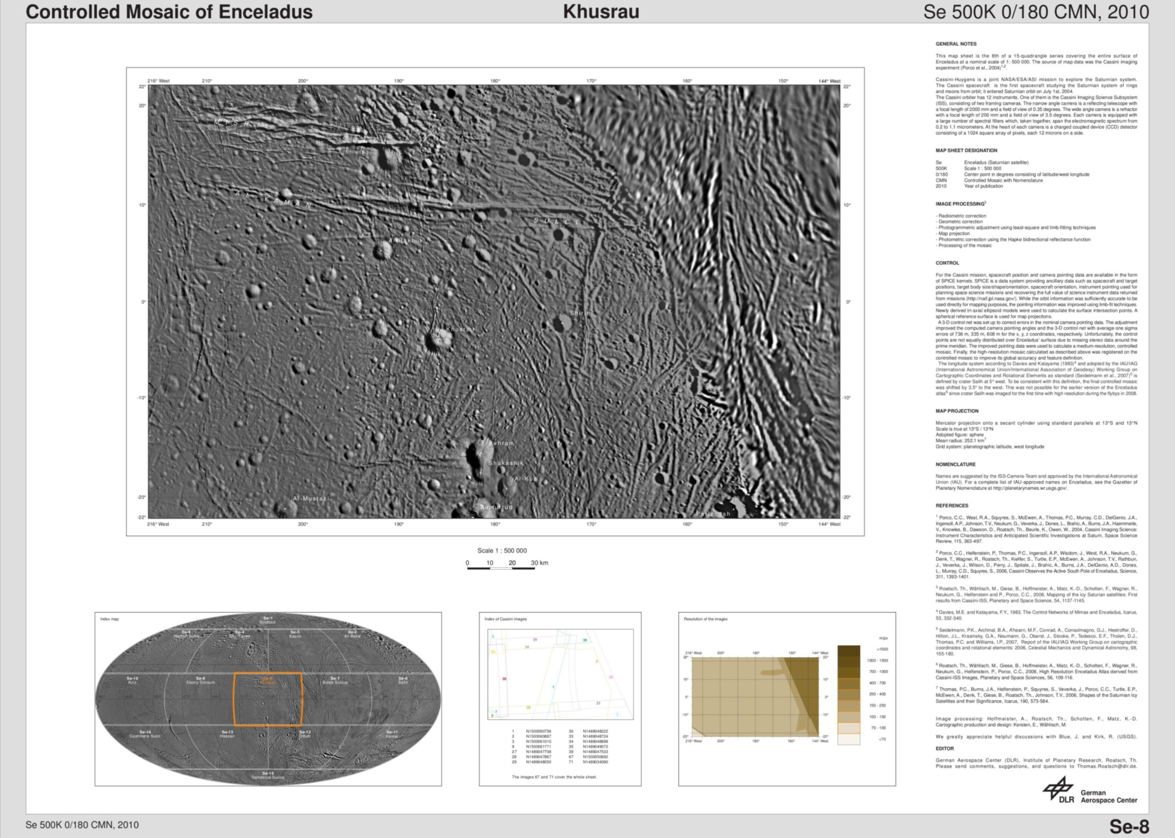
Here is one of the map sheets at its full resolution. I picked this one in particular because it has a blend of linear and cratery features, and because its title and its environs contain several names common among my Parsi in-laws!

In addition to the map with all the IAU-approved feature names, there's information on specifically which images were used to create the map, and what their native resolutions were.
Maps are cool. I'm sure everyone reading this blog has, at one time or another, lost an hour or several turning the pages of an old-fashioned printed atlas. (Ha. While I call a printed atlas "old-fashioned," I need to admit that I still find myself printing out scientific papers to read in hard copy, and I consult the enormous tome that is the NASA Atlas of the Solar System at least once a week.) But more than being cool, maps are the foundational data needed for a proper understanding of the geology and geophysics of any solid-surfaced world. Looking at interesting craters and grooves on individual Cassini shots is cool, but it's just stamp collecting until you can plot all those features on a rectified map and begin to understand how they all relate to each other. Which is why, nearly six years into the mission, the science on Cassini is only just beginning, and why there is so much more to look forward to.
Go to NASA's Planetary Photojournal if you'd like to see more of the map sheets. They also released three sheets on Mimas today: 1, 2, 3.
Support our core enterprises
Your support powers our mission to explore worlds, find life, and defend Earth. You make all the difference when you make a gift. Give today!
Donate

 Explore Worlds
 Find Life
 Defend Earth

