Jason Davis • Jun 13, 2014
Is Mainstream Space News Adrift?
The Houston Chronicle has a new, interactive web series on America’s space program. Why don’t we see more space coverage in this format?
This week, the Houston Chronicle released part two of “Adrift”, its interactive web series on the state of America’s space program. The series author is science writer and blogger Eric Berger. Part one examined NASA’s problematic relationship with the Russians over access to the International Space Station. The newest installment looks at controversies surrounding the Space Launch System, NASA’s expensive new rocket slated to carry humans beyond Earth orbit for the first time since the Apollo program.
Berger delivers a solid, compelling narrative. Both parts ring in at 3,000 words each. The stories are well-sourced and include access to top NASA brass, including administrator Charles Bolden, who delivers a few eyebrow-raising quotes.
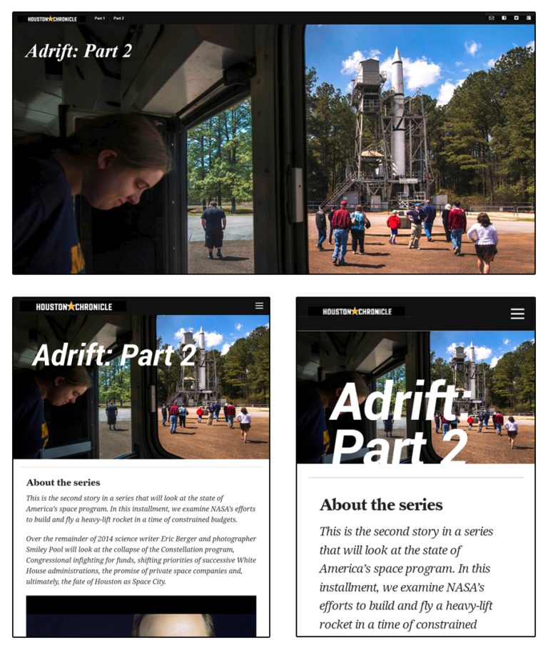
What makes “Adrift” most noteworthy, however, is its presentation. It uses a specially designed website formatted differently than the rest of the Chronicle’s stories. There are full-screen images, video clips and interactive elements to immerse readers in the story. Only a small navigation bar betrays the fact that you’re still on the Chronicle’s website. The goal seems to be creating an immersive, distraction-free experience: pay attention, this is important stuff.
“Adrift” is part of a new trend in online journalism, where interactive multimedia is integrated within a feature story to enhance the storytelling experience. The technique gained steam in 2012, when the New York Times released John Branch's “Snow Fall,” a Pulitzer Prize-winning story about a deadly avalanche in Washington. If you’ve never seen “Snow Fall,” check it out. You’ll be joining about 3 million people that visited the story, a third of which were new visitors to the Times.
“Adrift” looks pretty tame next to “Snow Fall,” which isn’t surprising, considering The New York Times dedicated a small army to its production. Critics have argued that some of these new multimedia websites have too much interaction and ultimately detract from their core stories. There’s certainly a sweet spot that must be considered, but would 3 million people have read Branch’s story if it had appeared with the rest of the Times’ content?
There’s no shortage of examples to choose from when considering stories built in this style. Just recently, I read The Atlantic’s “Fire on the Mountain,” by Brian Mockenhaupt, and thought it was riveting. It examines the deadly 2013 forest fire near Yarnell, Ariz. that killed 19 firefighters. On the lighter side, NPR did a nice job with “Planet Money Makes a T-shirt,” in which they follow the construction of a T-shirt from cotton field to consumer.
At what point does an online story become ‘interactive?’ As this trend continues, the line is beginning to blur. One of the key features common to most of these stories is a responsive design. Responsive designs allow webpages to dynamically reconfigure themselves to accommodate different devices, browsers and screen resolutions. Take “Adrift,” for example. On my Windows 7 PC, with a resolution of 1920 x 1080, it looks great. It also looks good on my Nexus 7 tablet, both vertically and horizontally. The website even fares decently on my Nexus S phone, although some of the interactive elements don’t work.

Another feature common to these sites is full-width images. Part one of “Adrift” begins with a cover shot of NASA’s Mission Control Center in Houston. Photojournalists call this an ‘establishing shot’ because it sets the scene for following material. There are more photos throughout the story, including a 35-image slideshow from STS-135, the final space shuttle mission.
“Adrift” also has short videos. Some are standalone, like Berger’s short introduction piece. Others rely on the surrounding story for context. In part two, Space Launch System program manager Todd May talks about the exploration of space and the cost of SLS, which wouldn’t make much sense if you encountered it on YouTube. In this case, Berger has already introduced May and SLS, and we’re hearing his “sonorous Southern accent.” There’s nothing revolutionary about embedding videos in a story, but after already having decided to read a long-form piece, I’m more apt to watch quick sound bites than I am to sit through entire video features. Plus, shorter clips avoid drawing the reader away from the story.
Both parts of “Adrift” also include an interactive infographic. In part two, readers can click through locations where SLS is being constructed. For me, this particular infographic drives home a larger point: SLS requires a complex supply chain and represents a lot of jobs in a lot of congressional districts.
Why don’t we see more space news presented in this format? The beauty of space images just scream for this kind of full-featured treatment. Could it simply be an extension of the already small amount of mainstream news coverage space receives? Or are news organizations still struggling to figure out how to implement the new format, meaning we can expect more space stories in the future?
One standout example predating “Adrift” is The Washington Post’s “Destination Unknown,” by Joel Achenbach. The series includes four feature stories on NASA’s future, and covers some of the same ground Berger is tackling. Like “Adrift,” “Destination Unknown” is well-written and well-sourced. It covers the International Space Station, commercial spaceflight, the Asteroid Redirect Mission and the robotic exploration of our solar system. That last topic is particularly important, as many stories on NASA’s future seem to imply human exploration is the only thing the space agency does. It will be interesting to see the angles Berger selects for the rest of “Adrift”.
Outside of the mainstream press, there are more publications already embracing this new format. MATTER magazine comes to mind. MATTER’s content is published through the Medium platform, which allows anyone to create stories in this new format. I gave Medium a try last week, reposting my ISEE-3 spacecraft piece to see how it looked. I thought the result was impressive.
Medium, which was created by the co-founder of Twitter, doesn’t have to worry about advertising revenue. This makes for cleaner, prettier stories. It’s easy to see why traditional news organizations are slow to embrace the format, when so much of their revenue comes from ads. That’s a tough reality for an industry that is trying to figure out how to stay afloat in the digital age.
“Adrift” and “Destination Unknown” are important because their publishers have large reader bases, and it’s vital that space news continues to find a home outside the space community. Unfortunately, both of these web features have negative central themes: NASA is struggling. While that’s certainly true, I hope we’ll eventually see some space news in this format that involves less doom and gloom.
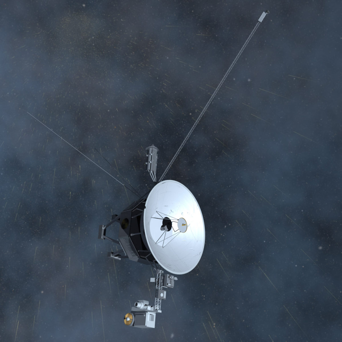
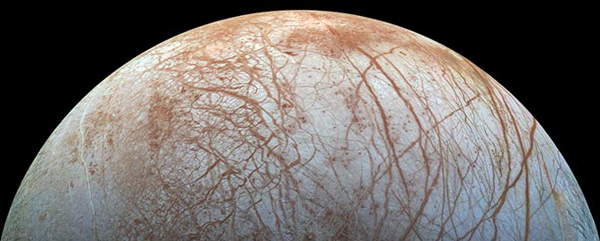
For instance, consider the Voyager spacecraft. Last year, Voyager 1 garnered national attention when NASA announced it had entered interstellar space. Imagine if The New York Times were to release an interactive web series covering the history (and future) of the program. Beautiful, full-screen images of the outer planets could be featured. Interactive infographics might model the probes’ solar system tours. Video interviews with original mission scientists and engineers could augment a long-form story. The Voyagers represent a compelling, feel-good story that appeals to general audiences.
Your move, Times.

Support our core enterprises
Your support powers our mission to explore worlds, find life, and defend Earth. You make all the difference when you make a gift. Give today!
Donate

 Explore Worlds
 Find Life
 Defend Earth


