Emily Lakdawalla • Dec 20, 2008
Some early Christmas presents at the PDS
Once a quarter, most NASA missions have to submit a chunk of archived data from their instruments to the Planetary Data System, or PDS. Those data submissions aren't due to show up until January 1, but two missions have come through a couple of weeks early with their data dumps. You can find the latest (and all previous) releases of Cassini data here -- the latest covers Cassini's activities from October 1 to December 31, 2007-- and the first 30 sols' worth of Phoenix data are here.
These data aren't in a format that is particularly friendly to the casual user; it's meant as a permanent archive, and it's kept in a format that's useful for scientists. The PDS has developed a fairly easy-to-use piece of software called NASAView (available for multiple platforms) that allows you to open images (you can download that here), and if you want to convert a big pile of data from the PDS format to an easier-to-use format, I wholeheartedly recommend Björn Jònsson's IMG2PNG.
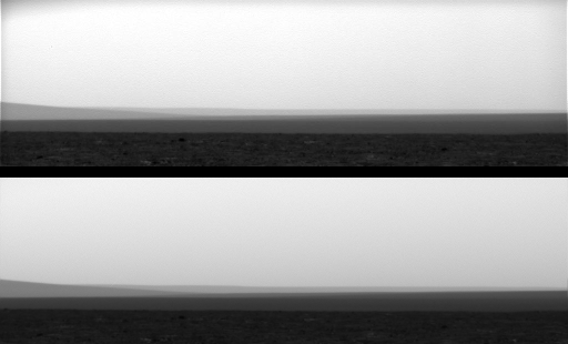
The original JPEG images are good enough for most casual users who want to just browse through the images to see what a spacecraft's done. (In fact, even science teams make frequent use of the raw image pages for that purpose.) But if you want to process images -- make color versions, or mosaics -- it's worth your time to learn how to use the ones you can find on the PDS. Here's an example of how the calibrated images differ in subtle but important ways from the original raw JPEG versions. (Thanks to Peter Masek for pointing out this example.)

NASA / JPL / UA
Comparison between uncalibrated JPEG (top) and calibrated (bottom) Phoenix images
These two segments of Phoenix images illustrate the difference in quality between the versions of the images that were rapidly released to the Web soon after they were acquired and the ones that are now stored in the archive at NASA's Planetary Data System. When images first arrive on Earth, they were quickly processed into a format that could be shared with the world, before any calibration steps were performed. They were sent to the Internet in a format, JPEG, that compresses the images, making their file sizes smaller. But JPEG format is a "lossy" one, meaning that the JPEG image is not as high-quality as the original. The loss of quality is evident in the mottled texture of the sky, and the fuzzy boundaries between the distant hills and the sky. The archived version (below) has none of these artifacts; the sky is a smooth color. In addition, the calibrated version of the image has been flat-fielded, which removes vignetting, the darkening of the original image toward the corners. Note that the upper corners of the top image are darker than the rest of the sky, while in the lower image, the sky is the same gray tone right out to the corners. The flatfielding and other calibration steps performed on the archived images mean that mosaics made from more than one image will have less obvious seams.Support our core enterprises
Your support powers our mission to explore worlds, find life, and defend Earth. You make all the difference when you make a gift. Give today!
Donate

 Explore Worlds
 Find Life
 Defend Earth

