Emily Lakdawalla • Dec 29, 2015
Two epic photos of Earth -- but which one is truer?
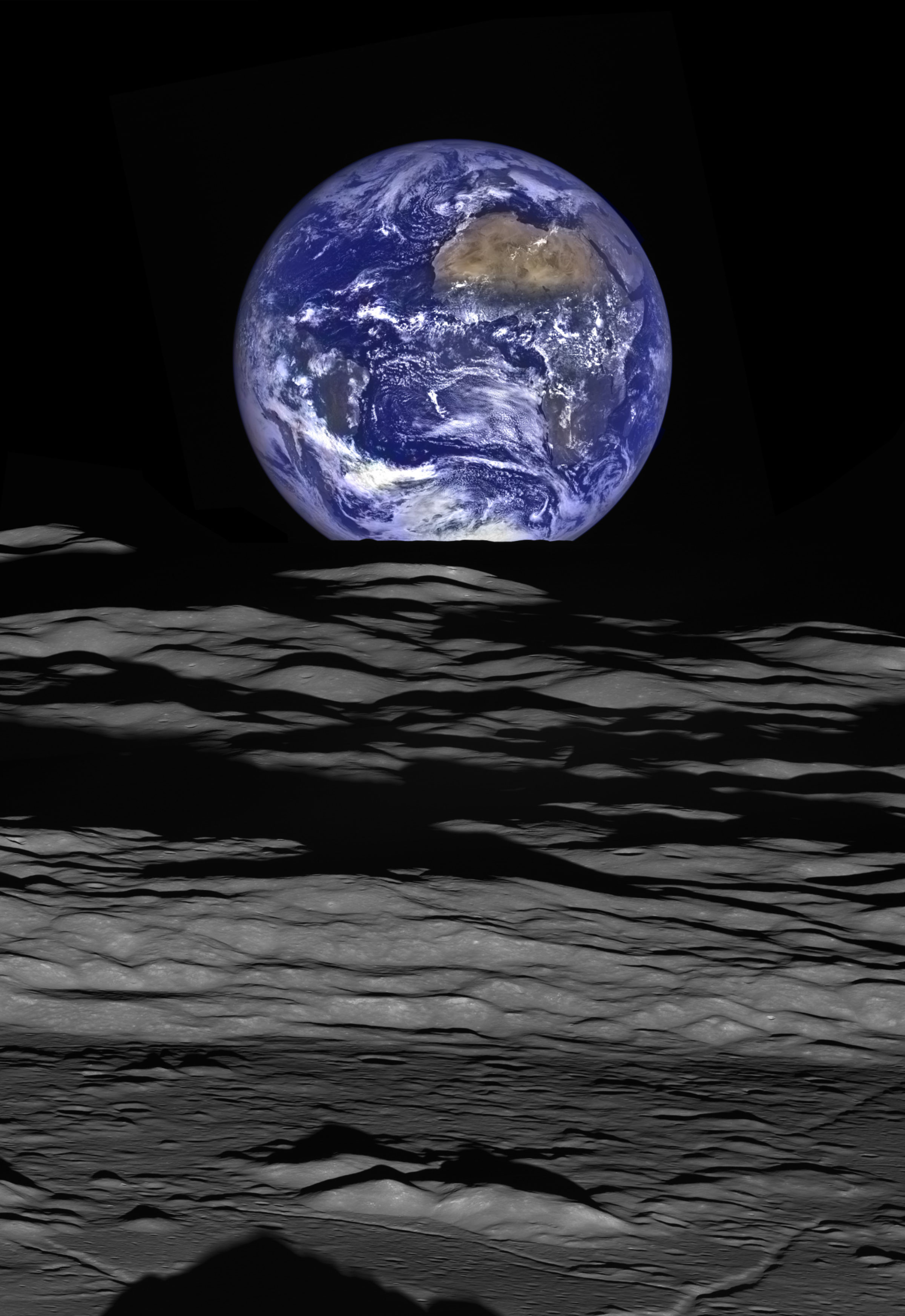
A couple of weeks ago, the Lunar Reconnaissance Orbiter Camera team released this fabulous image of Earth seen over the lunar limb. It is well worth enlarging to its full 8520 by 12388 pixels. Go ahead and do it, I'll wait.

The Web feature on this image goes into great detail about how it was created. The short version: the detail is from Lunar Reconnaissance Orbiter's Narrow-Angle Camera (NAC); the color is from the Wide-Angle Camera (WAC). The WAC has only 1/75 the resolution of the NAC, but they were able to combine about 50 color exposures to get more color detail from super-resolution processing, and then they overlaid the color on the more detailed photo. Because both cameras build up images by scanning lines of pixels across a scene, it took a complicated series of slews to set up the image, a process summarized in the two videos below. If you watch the videos you'll realize that this isn't an "Earthrise" -- from the point of view of the spacecraft, Earth is setting. It's motion of the spacecraft, not rotation of the Moon, that's making Earth appear to set; the same was true for the famous Apollo 8 Earthrise photo.
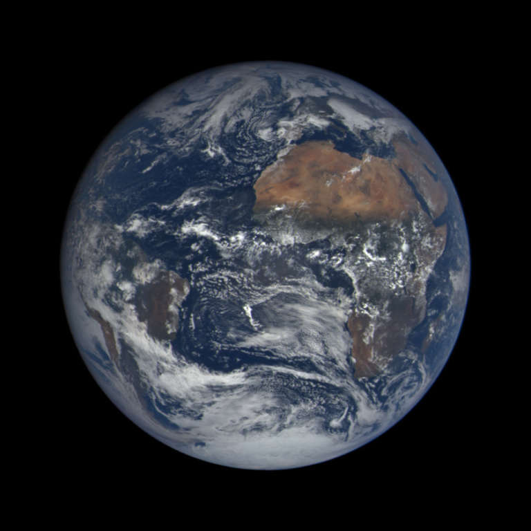
A sharp-eyed reader (who wanted to be named only as "Planetary Society member Mike") pointed out to me that DSCOVR took a photo of Earth within 15 minutes of the same time as the LROC photo:
If you compare the cloud patterns you can see the images were taken at very nearly the same time; there are small viewing geometry differences. But the color differences are major. Why does the color look so different? Which one is right? I've aligned the two images so that you can compare them:
"True" color is highly subjective. Human color perception involves signals from receptors in our eyes being interpreted by the brain. The cells in our eyes are sensitive to very broad, overlapping ranges of colors of light. But the phosphors or LEDs or LCDs in your monitor produce only very narrow bands of color, and the original data for these images was also taken in extremely narrow slices of the electromagnetic spectrum -- slices that correspond neither to the wavelength at which your eyes are most sensitive, nor to the colors that your device can emit.
So they only approximate true color, and they approximate it in different ways. We do that in space imaging by taking black-and-white photos through three different-color filters and then projecting one of those images in red light, one in green, and one in blue. To make Earth look like Earth, you need to start with three images that were taken in something close to red, green, and blue wavelengths. Both the DSCOVR and LROC teams did that to make these two Earth photos, but they started with different-wavelength images, and combined them in different ways.
Here is one list that I found showing how wavelengths of light correspond to different perceived color. You can find lots of tables like these on the Internet, and all are slightly different from each other, because color varies continuously.
- Violet: 370-455 nm
- Blue: 455-492 nm
- Green: 492-577 nm
- Yellow: 577-597 nm
- Orange: 597-622 nm
- Red: 622-730 nm
The color in the DSCOVR photo comes from three images taken through three very narrow-band filters at wavelengths of 680, 551, and 443 nanometers, which are a decent match to this particular list describing human color perception. Furthermore, the DSCOVR EPIC team's goal for its Earth photos is explicitly to create images that simulate what the human eye would see; they "reduce the contribution of blue and slightly change red" in order to simulate human color perception. (You can read more about DSCOVR EPIC color image processing in this blog entry.)
The color in the LROC photo comes from three narrowband filters at wavelengths of 604, 556, and 415 nanometers. The LROC photo has much more contrast: the darks are darker, the bright clouds as white as white can be. The two filters covering the browns and greens of land are much closer to each other in wavelength for the LROC photo than for the DSCOVR photo, so there's less spectral variation among them, giving the land an overall yellow appearance (similarly bright in both red and green channels), where in the DSCOVR photo the desert north of Africa swirls with reds and yellows.
To do better than the DSCOVR photo, you'd need a spacecraft equipped with broader-band filters that allow a wider range of wavelengths through to the detector. Both Voyager and Cassini color imagers have such broadband filters in red, green, and blue wavelengths, although Voyager's detectors were insensitive to the redder end of the spectrum. They're still not perfect though; to do better than that, you need a spectrometer that can image in many, many wavelengths and then convolve the spectral data with human visual response.
So, can either of these Earth images be called "true" color? To my mind, the DSCOVR one is a very close approximation, the LROC one somewhat less so, but both represent Earth seen in the kinds of light human eyes can see, which is about as "true" as you typically get with spacecraft imaging, and that is good enough for me.
Support our core enterprises
Your support powers our mission to explore worlds, find life, and defend Earth. You make all the difference when you make a gift. Give today!
Donate

 Explore Worlds
 Find Life
 Defend Earth


