Paul Byrne • Oct 05, 2018
How to design an effective scientific poster
The Challenge
Every year, thousands of scientists present their latest findings in poster format at scientific conferences, workshops, and symposia. Posters can be a highly effective way to communicate science—but every year, poster halls are full of cluttered, hard-to-read sheets that are full to the brim with text and anything but straightforward to understand. It turns out that making a scientific poster is easy. Making an effective scientific poster is less so.
The reality of poster sessions at scientific meetings is that, in general, most people will not spend long at a given poster, will not specialize in the topic it describes, and will not proactively ask questions of the presenter (assuming she/he is at hand). But the goal of any presentation should be to help the audience understand something they didn’t before—so given these constraints, how can we use posters to explain our science as quickly and effectively as possible?
The Concept
In short, a poster should be as close to an infographic as possible.

Infographics (a combination of “information” and “graphic”) are an increasingly common tool for data visualization, designed to communicate a message quickly, easily, and with as few assumptions about the background of the reader as possible. Most infographics we’re likely to encounter are about topics less complex than a scientific research project—think a timeline for the exploration of Saturn, Napoleon’s Russian campaign, or arguably the London Underground map or the Golden Record cover—but the fundamental approach holds true. The most effective poster will therefore:
- contain a single, key take-home message;
- convey that message by itself (but will make the reader want to talk to you/read your paper);
- be accessible to those not in your immediate field; and
- be quickly accessible to the reader.
It might help to think of what a poster should not be: a straightforward conversion of a meeting abstract (or, worse, a manuscript) to poster format. Instead, a poster is your tool with which to take advantage of how the human brain takes in and processes visual information to deliver a presentation your audience will benefit from (and might even enjoy)!
The Approach
There are a few simple steps to help improve the clarity and accessibility of a scientific poster, which can broadly be broken down into figures, text, and layout.
Figures
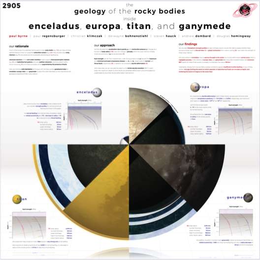
However you illustrate your work, put the graphical elements of your presentation front and center. For example, a geochemist might build their poster around a particular plot that conveys their single biggest finding, or a geologist could use a topographic map to underpin the rest of the poster. Whether you put a single image in the middle of the poster and arrange everything else around it, or even use an image as the background of the entire poster, a core graphic will not only tie your content together but will help in attracting the attention of a visitor who might otherwise pass by.
Text
The golden rule is to keep text to a minimum. Various sources give approximate word counts (e.g., no more than 800 words), but however many words you end up with, it’s probably too much: less is definitely more when it comes to text. And, just as for scientific talks (and indeed scientific presentations of any kind), it’s vital to minimize jargon and acronyms as much as possible.
Layout
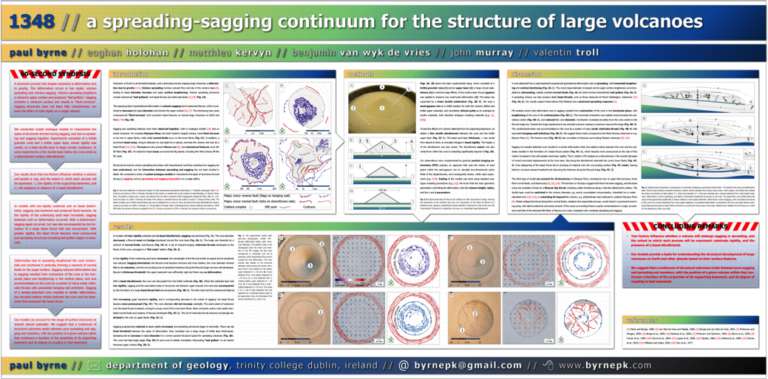
There is no single “correct” way to arrange the content of your poster, although a lot will depend on the size and orientation of the poster board (see “Logistics”). Your personal preference might be to place text (with or without bounding boxes) around a central image, or place the text in blocks along the top or side of the poster. Sometimes even a straightforward “matrix” (e.g., two text boxes across, three down) will work.
What’s critical here is that the narrative of your poster is clear: that the reader can follow the flow of information on the poster, and can find your key take-home message with as little effort as possible. Numbers or arrows, for example, guide the reader through the poster and help ensure that their attention is focused where you want it (such as finishing up on your take-home message). Regardless of shape and size, however, try to avoid filling up every bit of available space on your poster so as to give it, and the reader, room to breathe.
The Logistics
You know what you’re going to say. You know how you want it to look. Now let’s talk about how you’re going to make an awesome poster.
Size and Orientation
It goes without saying that before even planning what to put on your poster, find out the poster presentation guidelines for the meeting you’ll attend. Generally, conference websites include not only the amount of real estate (e.g., 44” inches square for both LPSC and DPS in 2018), but also the orientation of the poster boards if the horizontal and vertical dimensions differ (e.g., posters at the 2017 AGU Fall Meeting had “landscape” orientations). A poster jammed into a space too small for it (or swimming in empty poster board) is certainly eye catching, but not in a good way.
What Program?
A common program for drafting scientific posters is PowerPoint. More recent editions of that software have ever increasingly capable graphics functions, but a dedicated graphics program such as Adobe Illustrator or CorelDRAW is best. However, many institutions and individuals don’t have access to expensive software like the Adobe Creative Suite—so what matters less is the program, and more how you use it. (Indeed, all of these points apply just as much to a poster drafted by hand!
Colors
Just as for text, less is more when it comes to color. A simple color scheme, with no more than four colors (excluding black and white), can make a strong visual impact. (This advice doesn’t necessarily pertain to images on the poster, but to the colors you choose for the text and any other major poster elements.) There is a huge volume of material available online about color theory, the use of contrast in graphic design, and even how to break the rules, but sticking to a simple set of colors will go a long way toward making an attractive and visually appealing poster.
A vital thing to remember when making posters (or anything you print) is to use CMYK color space. In printing, colors are produced in a different way than on a computer screen, and so what looks like red on a PC monitor might print as pink. Because it is built for slideshows, PowerPoint handles image data only in RGB color space—it can’t export CMYK images. So if you do use PowerPoint to build your poster, it’s best to be prepared for the possibility of some strange color changes in the final product.
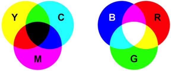
There are lots of online tools to help you pick a color palette, including ones that identify colors in an image you already have, or that start with a random palette you can fully customize, or even ones that start with a single color and let you go from there. There are also tools to help convert colors from one format to another (as many websites represent colors with hexadecimal codes instead of CMYK or RGB values).
Figures
Whatever figures you choose for your poster, it’s important to be aware of their resolution when printed. A common guideline is that images should be printed at a resolution of at least 300 dots per inch (although really it’s pixels per inch that matters), but a lower-resolution image will still look OK on a large poster from a few feet away. Numerous resources online will help you determine how big a figure should be (in pixels) for it to look OK at a given size (in inches) on your poster, but the bottom line is that the bigger an image you have, the better for printing purposes.
Text
The font you choose for telling your story is almost as important as the story itself. (Almost.) Whereas most fonts in books, journals, and newspapers are serif fonts (i.e., the letters feature small lines at the ends of strokes), most online content uses sans serif fonts. Serif fonts can help guide the reader’s eye along lines of text, and certainly have a use in poster design. But serifs can also clutter text. Generally, sans serif fonts are best in graphic design, and widely available examples such as Arial, Calibri, Helvetica, Verdana, and Tahoma can dramatically enhance the legibility of a poster over, say, Times New Roman or Garamond.

Just as essential for clarity as the font you pick is how you display it. Many programs (including PowerPoint and Illustrator) allow you to change the leading and kerning of text—the spacing between lines and between letters, respectively. Sometimes a smaller font with greater leading is a better choice than larger text that’s closer together. Other things to aim for include: making the text legible from about 4–6 feet away (so a visitor can still read your poster even if you’re entertaining a gaggle of people right beside it); ensuring that columns of text aren’t so wide that the reader will need to swivel their head to take it all in; and a title that’s short enough to fit on the poster when set in extra-large (and so extra-visible) letters. (Short titles are a good idea in general, not only for posters but for talks, abstracts, and even papers.)

The Outlook
Personable preference and aesthetic, scientific discipline, data types, and software access will certainly influence how scientists prepare and present their posters for the foreseeable future. However, whether these tips and strategies are old hat or brand new, incorporating even a few in your next poster will enhance its message in an ever-more-crowded poster hall.
Support our core enterprises
Your support powers our mission to explore worlds, find life, and defend Earth. You make all the difference when you make a gift. Give today!
Donate

 Explore Worlds
 Find Life
 Defend Earth