Emily Lakdawalla • May 22, 2015
Tons of fun with the latest Ceres image releases from Dawn
Fantastic new images of Ceres continue to spill out of the Dawn mission, and armchair scientists all over the world are zooming into them, exploring them, and trying to solve the puzzles that they contain. It's tremendous fun to have the opportunity to see a new world for the first time, discover strange features, and try to explain them. I do see a lot of amateur scientists making some mistakes when trying to interpret the images, and thought I would spend a blog post explaining them, and then highlight some of the cool things that members of the public are doing with the photos.
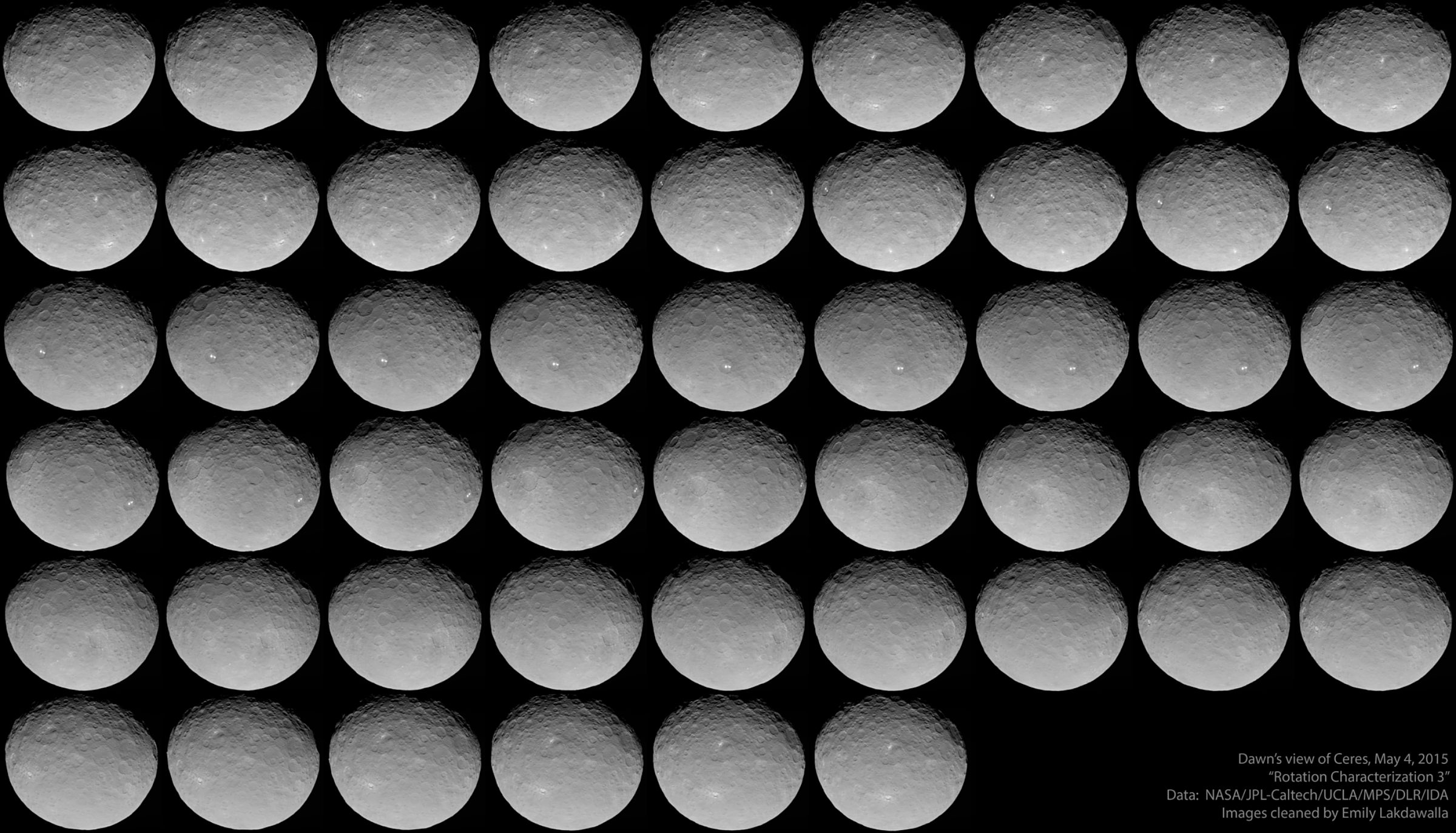
Let's begin by looking at this absolutely fantastic animation of a spinning Ceres, which contains 51 unique images and covers slightly more than one rotation.
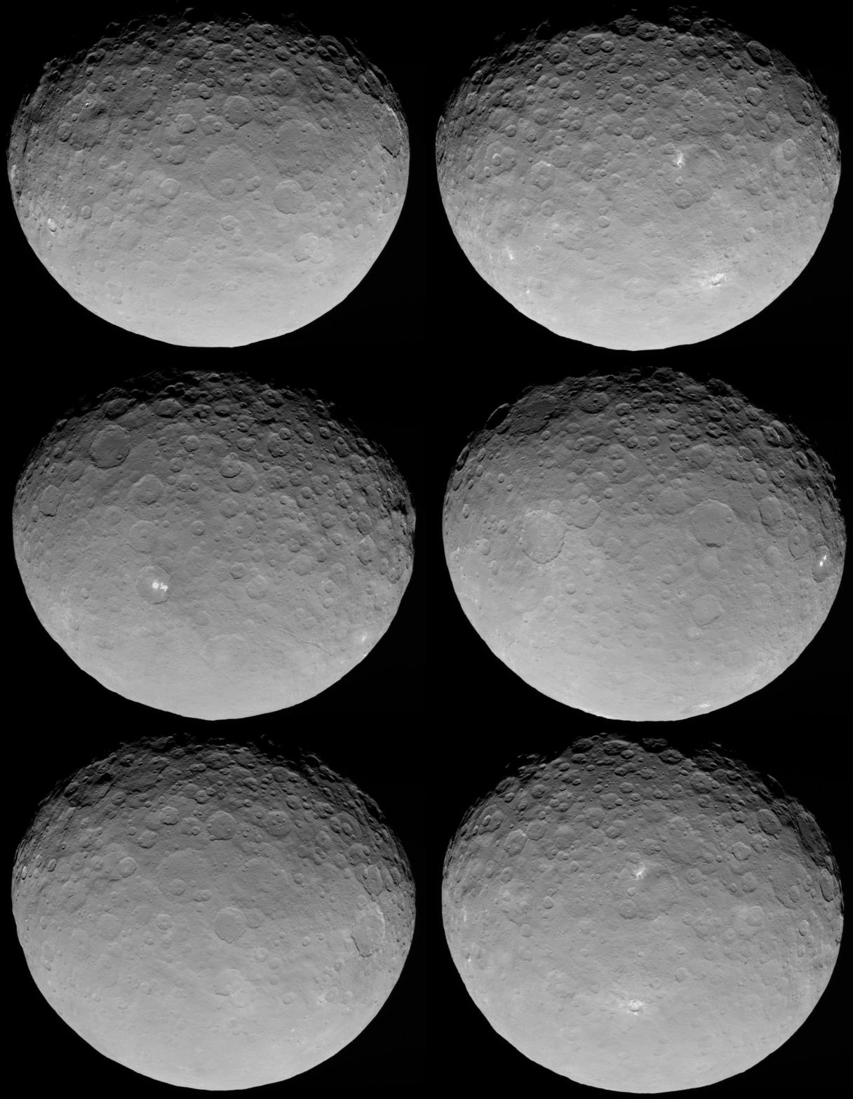
The first thing most people notice is that the mysterious white spots are breaking up into more white spots than we saw previously, but they're no less mysterious than before. I have read members of the science team suggest either exposed ice or salts as a possibility. The second thing people notice is mysterious black dots jumping around the image. I've had people ask me if these were mini-moons of Ceres, or perhaps caves on Ceres, and I'd not be surprised if there were some denizens of the Internet interpreting them to be ships of the Air Force of the Cerean Ice Weasels.
But if you look closely, you'll see that a lot of the black spots have the same shape from image to image, yet they're in different places on Ceres. Moreover, when there's more than one black dot in an image, they tend to be in the same position with respect to each other. That's no moon; that's schmutz in the camera. One of my followers on Twitter made a video to demonstrate the persistent relative positions of the three most obvious schmutz bits, which is helpful, but I wanted to clean them off the images entirely. So I took the frames from the animation and aligned them on the schmutz bits, then stacked them, averaging together the values of all the pixels at each spot. This process revealed 8 or 9 schmutz spots that fleck all of the Dawn images, circled in yellow on the image below.
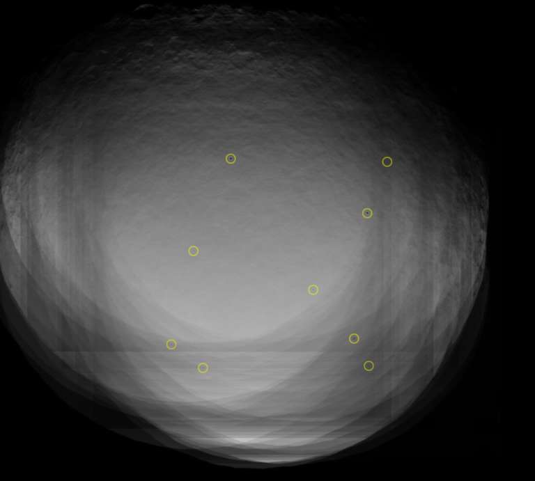
In Photoshop, I took my schmutz map into the animation and used it to identify where all of the offending spots were on each of the 51 frames, and erased them using either the healing brush or the clone stamp. In doing so, I've crossed the line from "analysis" to "art". These images are no longer suitable for science, which is why science teams generally do not do this kind of blemish removal on their images before posting them. There is no worse thing for a scientist to do than to manufacture data! But now the rest of us can enjoy the animation without the distractions of dark spots, and people won't email me about caves and moons on Ceres. Or ice weasels. I have also slowed down the animation a little, and I removed a few of the frames so that the first and last frame match more closely.
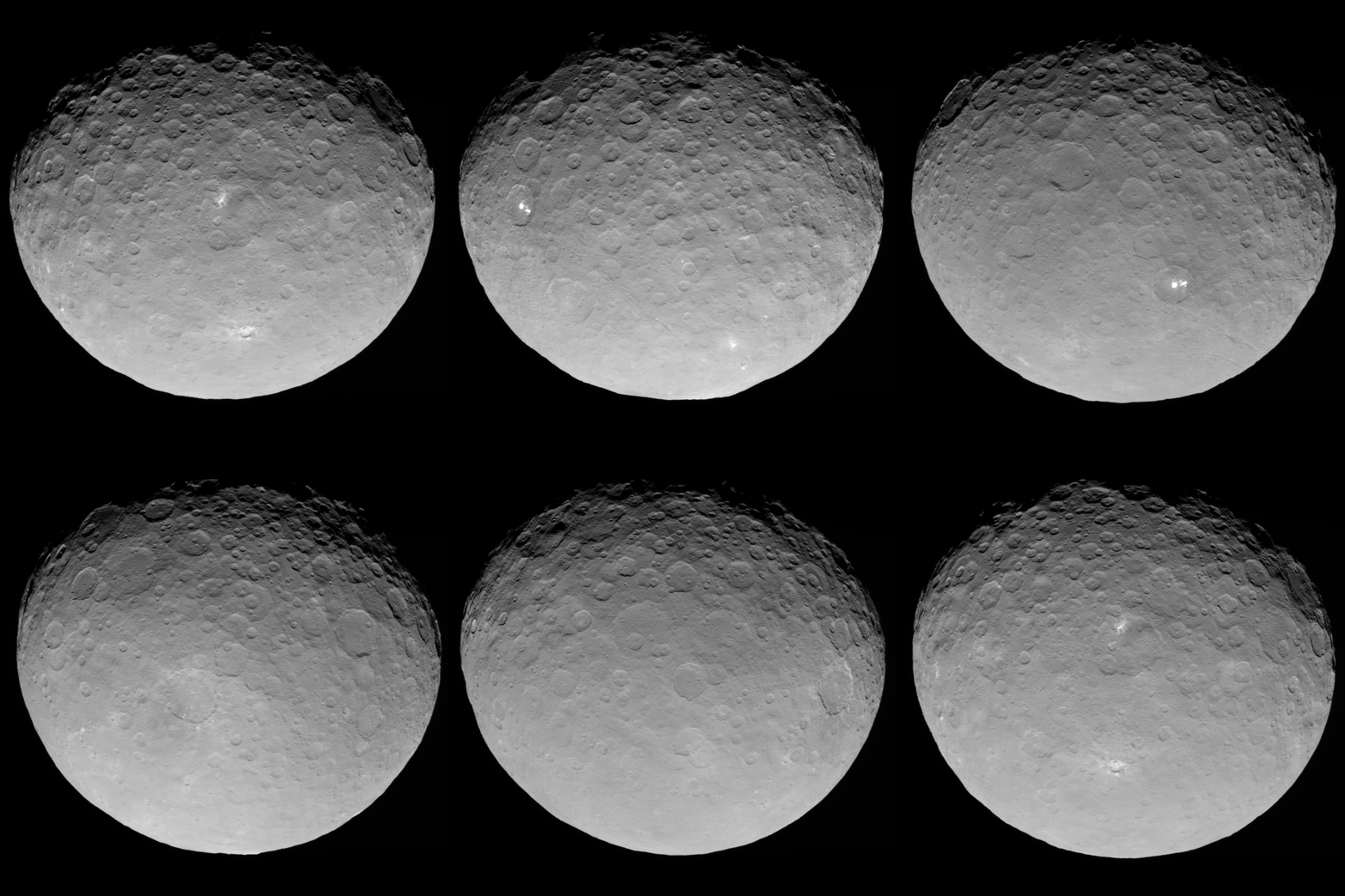
Here's an alternate version of the corrected images. It is so awesome that they have shared so many images with us. You can check out interesting features and see how they appear to change as Ceres' rotation carries them in and out of view.
Dawn is now spiraling downward further, and has captured several images for optical navigation in which Ceres is so large that it more than fills the field of view. Here is the best photo yet of those mysterious bright spots -- and a new opportunity for memebrs of the public to misinterpret images. I'll show you the photo, then explain.
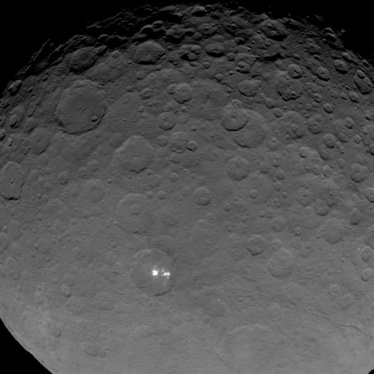
I have seen many people crop out the crater with the white spots, enlarge it several times, and stretch its contrast to try to see more detail (see, for instance, here and here and here). Unfortunately, there is no more detail to be seen. The white spots are saturated -- as white as white can be -- and all the enhancement that everyone is doing to them is only bringing out JPEG compression artifacts. To explain: JPEG is an image format that compresses image data by converting lists of pixel values into much shorter lists of equations and coefficients (if you ever studied Fourier transforms in math or physics, it's a similar process). It's highly effective at shrinking photo file sizes, but when your computer turns the lists of equations back into a photo, it's not quite the same as the photo you started with; it's just an approximation. This is called lossy compression. The smaller the file size you compress the image to, the more of an approximation it is, and the more of the original information is lost. In highly compressed images, you can see artifacts of the JPEG compression scheme as a checkerboardy texture and as bright-dark-bright-dark pixel patterns wherever there was a sharp boundary in the original image.
The optical navigation photo that I included above was compressed so much before release that those dark schmutz spots I was talking about earlier in this post have been almost completely erased by compression artifacts. (I inquired with the mission whether the compression was done on the spacecraft or after arrival on Earth, and I was told it was done on Earth, so we have better versions of these images to look forward to once the science team formally releases the data.) In a way, the schmutz spots are actually useful here because they demonstrate just how much detail was lost with the JPEG compression. In the comparison below, the top row of images is from my schmutz map; the bottom row is from the Op Nav photo. In the bottom row you can see the 8-by-8-pixel checkerboard that is the telltale sign of JPEG compression, and one of the schmutz spots has almost completely disappeared.
The reason I'm going on and on about the JPEG compression is to make the point that it is a waste of time to try to enlarge the image of the white spots to reveal more detail. The only fine details available in this image are mostly not real. They have everything to do with compression artifacts and nearly nothing to do with geology. In fact, I'd recommend shrinking the optical navigation image before trying to study it, or maybe blurring it, as a method of deemphasizing the spurious features introduced by the file compression. The animation at the top of this post doesn't have the same problem; it was not posted as a JPEG but rather as a GIF. For black-and-white photos, it's possible for GIF to be a lossless compression scheme, and the quality of those images is much higher.
I could write a couple thousand words on interpretation of these photos, but I won't; there is enough detail in these photos and I have enough scientific training that for me to do too much writing about them would seem to be stepping on the toes of the science team. I will wait until they issue press releases, publish in Science, or present at a science meeting, and then I will critique their interpretations! What I will do is share some of the cool analysis that other denizens of the Internet have been doing with the pictures.
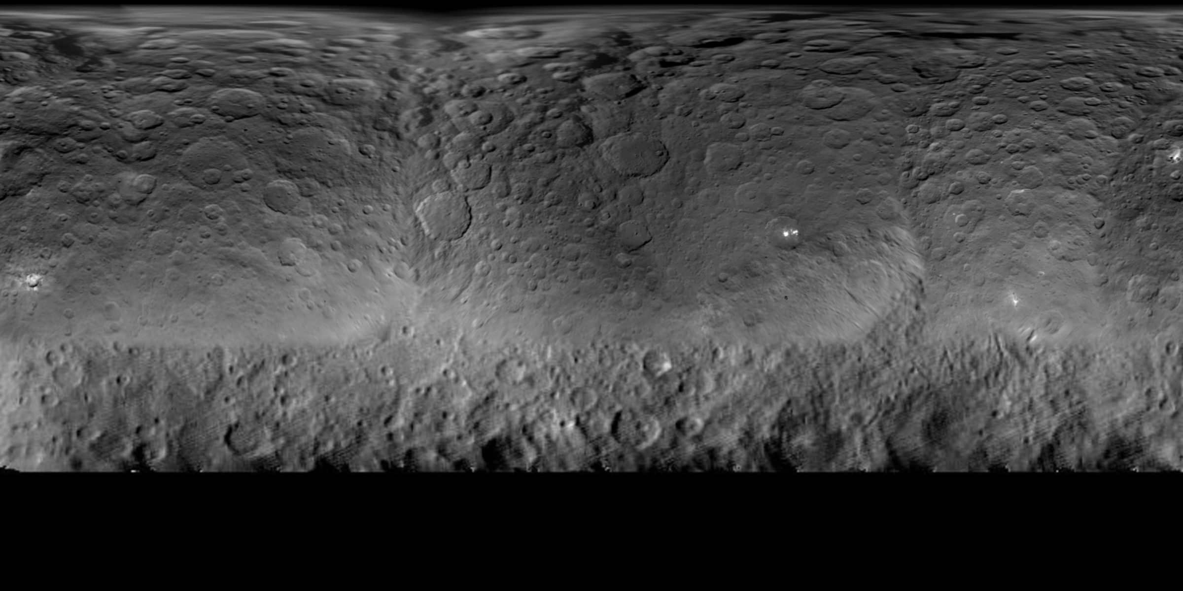
First up is this lovely updated global map of Ceres, which uses all of the most recent pictures, including and up to the publicly released ones from op Nav 8. (It came from this discussion on unmannedspaceflight.com, where you may find a more up-to-date version of the map if you are reading this post much after I wrote it.)
Grab your red-blue glasses to enjoy this really cool 3D view of a rotating Ceres, courtesy of Nathan Frey ("walfy") at unmannedspaceflight.com.
Probably the coolest thing I've seen is this animation, by user ZLD at unmannedspaceflight.com, of an isolated streaky peak in Ceres' southern hemisphere. The same user also made an animation of the white spots.
One item that I noticed that I can't help mentioning is: look at the center of this image and notice what a strikingly perfectly hexagon-shaped crater lies there.
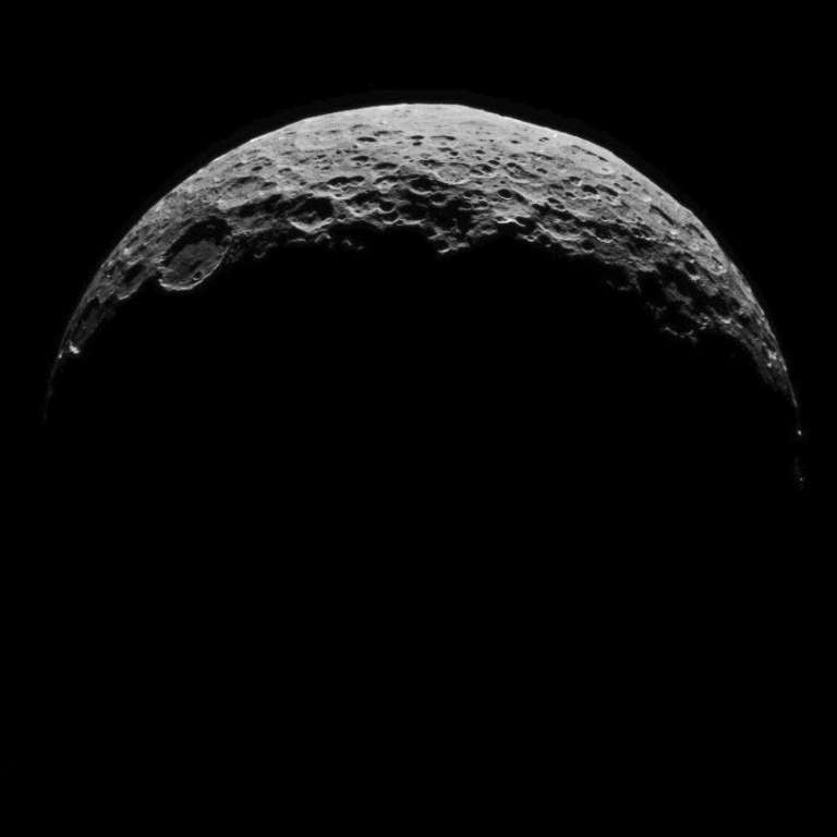
I'll close with a lovely crescent view of Ceres, one of three that the mission released last week. I love crescent views of worlds of the solar system, because the thinner the crescent, the more alike they all look. The craters are a little deeper and central-peakier than you'd see on Dione or Tethys, and the globe a bit lumpier than you'd see on Mercury or the Moon. But they all kind of look alike from this angle.
Support our core enterprises
Your support powers our mission to explore worlds, find life, and defend Earth. You make all the difference when you make a gift. Give today!
Donate

 Explore Worlds
 Find Life
 Defend Earth